Colour in the Office: How to use colour psychology to improve productivity
February 12, 2020 Patrick
More than ever before, colours are conquering the working environment.
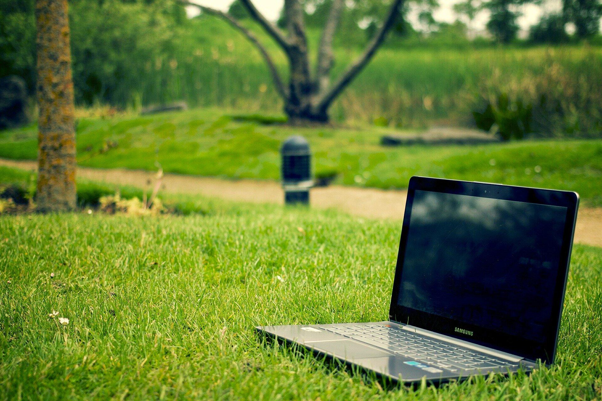
Modern offices are escaping from the bland cubicle design of early workplaces by incorporating natural tones and colourful features. Extensive research has linked a pleasant office aesthetic with increased staff productivity and overall wellbeing. Billions have been spent on improving the mental disposition of workers, with employers following recent office trends such as minimalism, biophilia and “scenicness”.
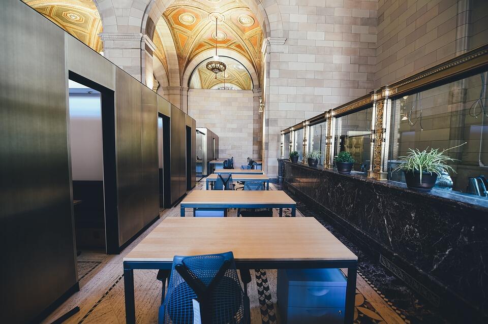
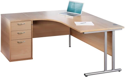
Modern office design regularly includes natural materials as well as monochrome colour palettes. Wood grain tables and storage are commonplace in today’s workspaces. Oak or pine desking is favoured by employers, promoting a professional yet homely look and feel. And minimal tones such as white, black or light grey are considered as the basis of a clean and uncluttered professional environment. Whereas colour, its intrinsic value and usefulness, has to some degree been overlooked.
Colour Psychology
Colour is known to affect our everyday state of mind. Studies on colour psychology show how our environment can drastically change the way we feel, operate and behave. Various colours represent various moods; they prompt a subterranean consequence for how people feel both psychologically and physically. Designers and marketers utilise elements of colour psychology to promote subconscious messages to their audience.
For example, Facebook recently underwent a major redesign, brought on as a consequence of the questions asked around the platform’s privacy and use of consumer information. The redesign involved a change from "the big blue app" to a largely white format. Previously the blue branding was thought to represent familiarity and friendliness. The white instead highlighted the company’s transparency and trustworthiness, an attempt to move past the public scandals. This expensive overhaul demonstrates the importance placed upon colours. Colours are a key part of how people affiliate themselves with an environment.
Decorating and furnishing an office demands thought put towards what colours employees are exposed to at work. Office designers aim to control colour schemes and choose those that promote productivity and serenity. Although the choice is unlimited, the main colour options involve either blue, red, green or yellow. These colours are rarely mixed in the same space. The use of one colour helps build a sense of identity - with the brand and within the workforce - benefitting company cohesion.
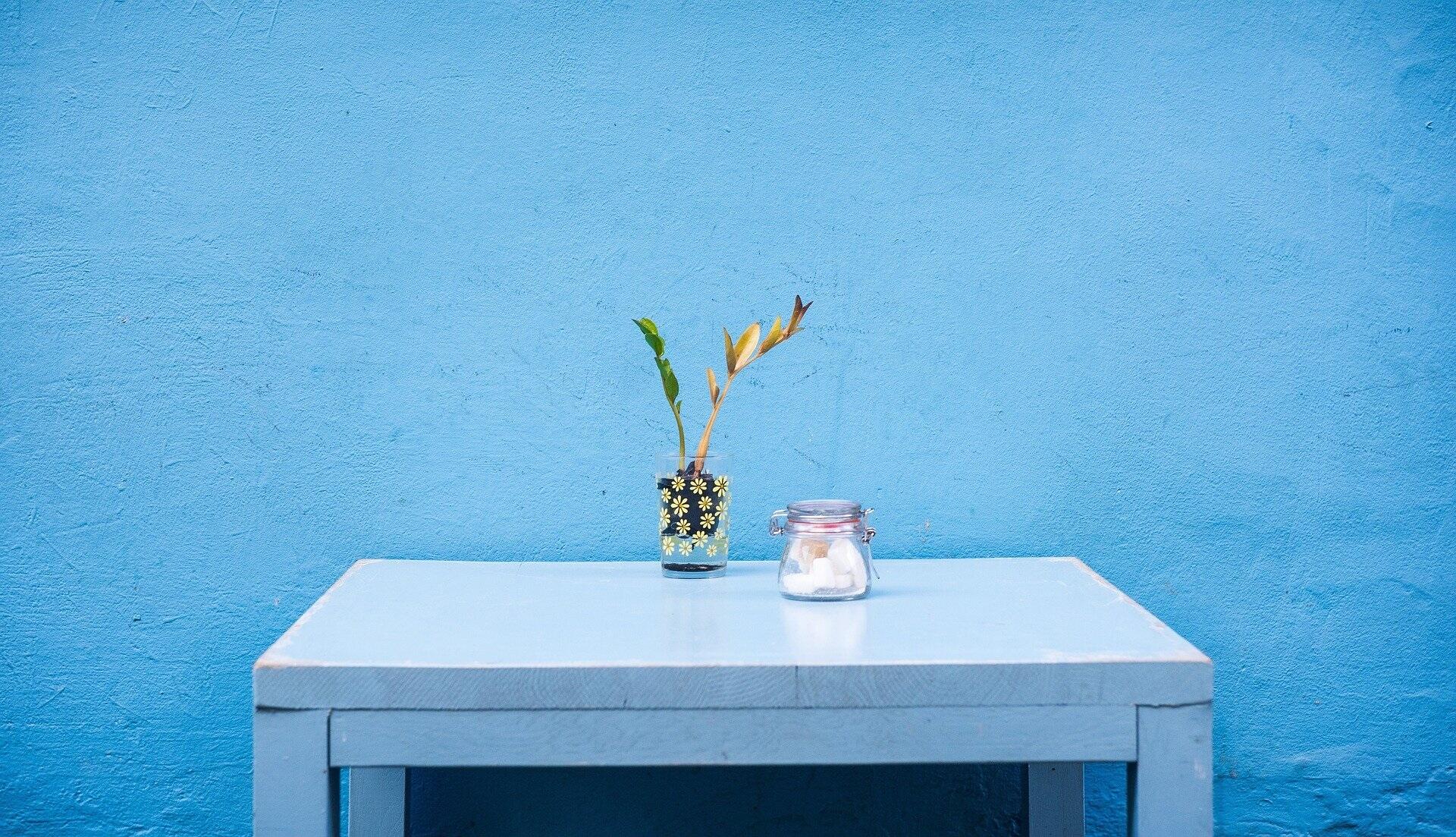
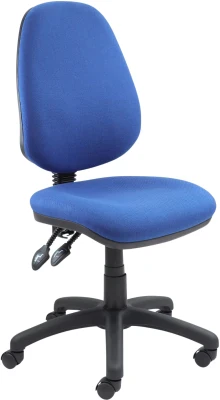
Blue
Blue is very popular in working environments. It promotes positivity and restfulness whilst also remaining professional. Most offices hold an element of blue, helping to de-stress colleagues and benefit creativity. Blue is great for workplaces that require focus and metal aptitude. Good for open plan workplaces where cooperation is already present, a blue effect will inspire productivity.
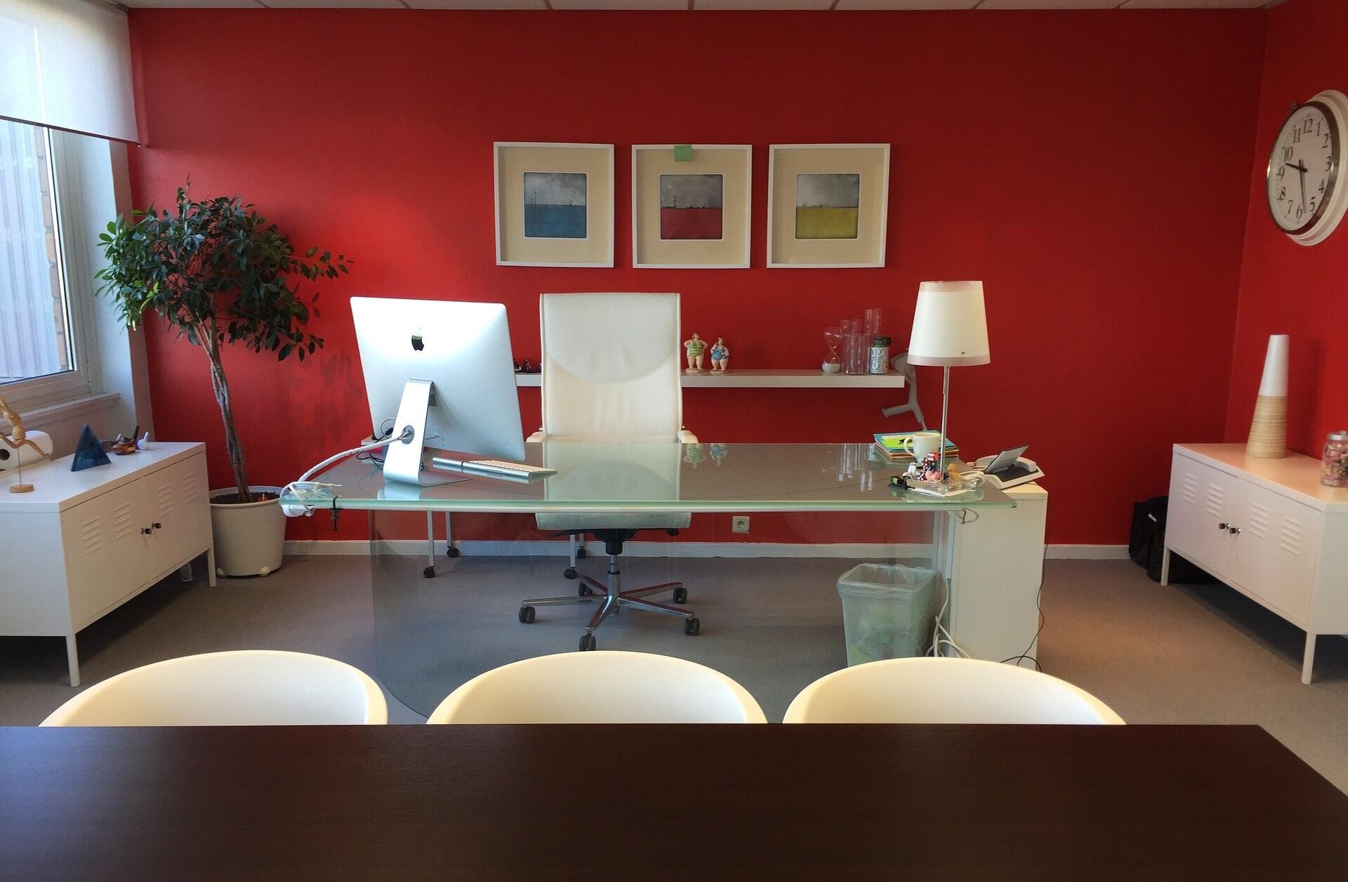
Red
A loud and noticeable colour, red is ideal for causing a reaction. The colour should be used sparingly or in large open spaces as it can be very distracting. Red is good in fast-paced environments and social spaces, useful for energising people, aiding interaction and bolstering a direct approach to tasks. Often toned down for use in meeting areas, this color can be very effective when applied correctly.
Green
Increasingly popular and great alongside the new office trend of plants in the office, green helps create a natural workplace. Green is a soothing and relaxing colour ideal for reception areas and conference rooms. It is strongly associated with ethical responsibility, and helps offices feel less urban and claustrophobic. Combatting formality, green is a good space-saver and shows a focus on worker wellbeing. The colour’s most advantageous quality is that it’s easy on eyes, perfect for locations where people may spend the majority of their time such as waiting areas.
Yellow
Very bright, yellow stimulates and inspires. Its boosts positive emotion and is great for collaborative spaces. But too much yellow is harsh on the eyes and therefore should be used in areas which see plenty of footfall. Good for refreshing and injecting confidence, yellow acts like a shot of adrenaline to an office space. Because of this, yellow is often used in break rooms, canteens and collaborative meeting areas.
Involving colour psychology in the design and furnishing of workspaces offers a range of benefits. Optimising a worker’s everyday environment can help maintain and improve productivity. It is important to focus not only on the wallpaper but also throughout the office, including the ceiling, carpet and furniture. Graphics such as artwork or living features can play a huge role in the aesthetic of the workplace. For more information, see our article How can art be used in the workplace.
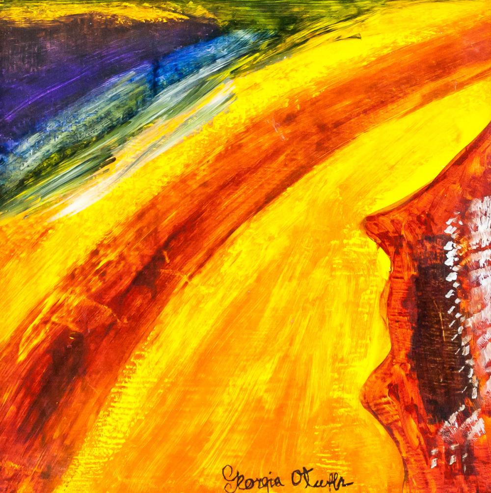
How can art be used in the workplace
“I found I could say things with color and shapes that I couldn't say any other way--things I had no words for.” Georgia O'Keeffe
CEOs and office designers, in their pursuit of creating the optimal workplace, are looking to employ artwork to do some heavy hypothetical-lifting.
Healthy working demands an agile working space. Formal meeting rooms and breakout spaces require separate approaches in their design. And as the modern office grows and evolves, we also expect the use of colour in professional environments to develop as well. Every office is different but the laws around space and colour psychology stay the same, hence why redesigning your office to benefit workers will prove to be a successful long-term decision.
Get a headstart this year with Office Furniture Direct's great range of colourful office seating.